Branding Assets
Official logos, brand guidelines and collection templates. Use these assets when building or promoting your marketplace presence.
Logo
The ORBIS wordmark for use across all brand touchpoints.
Icon
The ORBIS icon mark for favicons, app icons, and compact branding.
Brand Colors
The official color palette for Orbis Marketplace.
Usage Guidelines
When using Orbis Marketplace branding assets, please follow these guidelines.
Do
- Use the official logo files provided on this page
- Maintain clear space around the logo (at least the height of the logo icon)
- Use the dark logo on light backgrounds and the light logo on dark backgrounds
- Link back to the marketplace when featuring the logo
Don't
- Alter the logo colors, proportions, or add effects
- Use the logo to imply endorsement without permission
- Place the logo on busy backgrounds that reduce legibility
- Recreate or approximate the logo with different fonts
Typography
Orbis Marketplace uses Inter as the primary typeface across all interfaces. Available weights: 400 (Regular), 500 (Medium), 600 (SemiBold), 700 (Bold), 800 (ExtraBold).
Collection Hero Banner Templates
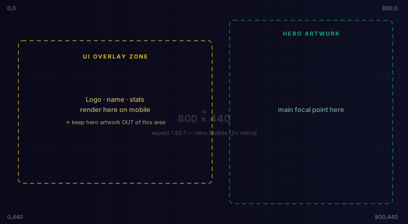
Drop-in starter files at the exact dimensions your collection's hero banner is rendered at on the marketplace. The marked overlay zone shows where the collection logo / name / stats / CTA sit on top of your artwork — keep important visuals out of that area. Open in any vector editor (Figma, Illustrator, Inkscape, Sketch), drop your art on top, hide the guide layer, and export as PNG / JPG / WebP at the same dimensions.